WARNING: Cushy is in early alpha. This guide doubly so.
Welcome to the Cushy User's Guide
This is a user's guide for Cushy, a Rust GUI crate. The documentation is a great resource for finding information about specific functionality quickly. This guide is aimed to providing an example-rich walkthrough of how to use and extend Cushy.
A "Hello, World" Example
Here's the simplest "Hello, World" example:
use cushy::Run;

fn main() -> cushy::Result {
    "Hello, World!".run()
}
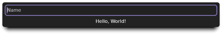
When run, the app just displays the text as one would hope:

That was a little too easy. Let's take it a step further by letting a user type in their name and have a label display "Hello, {name}!":
use cushy::value::{Dynamic, Source};
use cushy::widget::MakeWidget;
use cushy::widgets::input::{Input, InputValue};
use cushy::Run;

fn main() -> cushy::Result {
    // Create storage for user to enter a name.
    let name: Dynamic<String> = Dynamic::default();

    // Create our label by using `map_each` to format the name, first checking
    // if it is empty.
    let greeting: Dynamic<String> = name.map_each(|name| {
        let name = if name.is_empty() { "World" } else { name };
        format!("Hello, {name}!")
    });

    // Create the input widget with a placeholder.
    let name_input: Input = name.into_input().placeholder("Name");

    // Stack our widgets as rows, and run the app.
    name_input.and(greeting).into_rows().run()
}
This app looks like this when executed:
In this example, both name and greeting are Dynamic<String>s. A
Dynamic<T> is an Arc<Mutex<T>>-like type that is able to invoke a set of
callbacks when its contents is changed. This simple feature is the core of
Cushy's reactive data model.
Each time name is changed, the map_each closure will be executed and
greeting will be updated with the result. Now that we have the individual
pieces of data our user interface is going to work with, we can start assembling
the interface.
First, we create name_input by converting the Dynamic<String> into a text
input widget (Input<String>). Since Dynamic<String> can be used as
a Label, all that's left is laying out our two widgets.
To layout name_input and greeting, we use a Stack to lay out the
widgets as rows.
Don't worry if this example seems a bit magical or confusing as to how it works. Cushy can feel magical to use. But, it should never be a mystery. The goal of this guide is to try and explain how and why Cushy works the way it does.
About Cushy
Cushy is a Graphical User Interface (GUI) crate for the Rust programming language. It runs natively utilizing wgpu to render consistently-styled, cross-platform applications using hardware acceleration when available. It does not utilize any existing widget libraries.
Cushy's high-level goals are to be:
- Easy-to-use
- Flexible
- Predictable
- Efficient
- Accessible
Being so early in development, Cushy has not yet achieved all of its goals, especially with regards to accessibility.
Cushy's Philosophies
There are a lot of GUI libraries with wildly varying approaches to how UIs are displayed. Here are the philosophies that drive Cushy's design:
- Cushy retains information between redraws so that many events can be handled without redrawing the user interface.
- Everything is a widget. The "root" of a user interface/window is a widget, and widgets can contain other widgets.
- Composition is powerful and easy to reason about. The built-in widget library is aimed at providing a suite of single-purpose widgets that can be composed to create more complex user interfaces.
- If a developer dislikes a built-in widget's behavior, they should be empowered to create their own that behaves the way they desire. To ensure developers have this flexibility, all provided widgets must only utilize functionality that is publicly available.
- Widgets should be flexible in the types they support, prefering trait
implementations instead of hard-coded types. For example, the Label widget
supports any type that implements
Display. - Cushy needs both physical pixel and resolution independent measurement types. UI designers want to use real-world measurements that scale based on the DPI resolution of the device it is being rendered on. Widget authors and game developers want to work with pixel-perfect measurements to ensure perfect alignment.
From an implementation standpoint, Cushy has these goals:
- For graphics, provide a wgpu-centric library that exposes a rendering API inspired by wgpu's Encapsulating Graphics Work article.
- For windowing, embrace winit and route input events to the correct widgets. This allows widgets to support any features that winit can support.
- Cushy should be able to idle at close to 0% CPU. Cushy should not redraw unless needed.
Everything is a Widget
A widget is a rectangular area of a screen that implements the
Widget trait. Widgets are the fundamental building block of Cushy.
The Widget trait can look daunting, as it defines every possible function a
Widget might need in a graphical user interface. Thankfully, the details of
how this trait works can be ignored until you're ready to create custom widgets.
Developing a user interface in Cushy is a two-step process: gather the information for the interface and present the information in one or more widgets.
Cushy makes the process of creating widgets easy through the
MakeWidget trait. Every Widget implementor automatically
implements MakeWidget, but it can also be implemented by any type to make it
easy to utilize within Cushy. For example, String implements MakeWidget by
returning a Label. This approach can also be used to convert complex
structures into multi-widget components without needing to create any new
Widget implementations.
MakeWidget is also responsible for why "Hello, World".run() works. The
Run trait is automatically implemented for all MakeWidget
implementations. The implementation simply creates a Window from the
widget and runs it:
#![allow(unused)]
fn main() {
impl<T> Run for T
where
    T: MakeWidget,
{
    fn run(self) -> crate::Result {
        Window::for_widget(self).run()
    }
}
}
So now that we know our goal is to create one or more widgets to represent our data, how do we transform our data and application state into widgets?
Reactive Data Model
Cushy is designed around a reactive data model. In many UI frameworks, setting
the text of a Label is done by telling the label what it's new text
is. The Cushy way is to create a Dynamic<T> containing the value you want to
display, and give a copy to the label and keep a copy for your application to
update as needed.
When a widget uses a Dynamic<T>, it informs Cushy that it needs to be either
redrawn or invalidated when its contents change. In turn, when Cushy detects a
change, it invalidates what is necessary.
This means that updating a progress bar from a different thread is as simple as
passing a clone of a Dynamic<T> that has been provided to a progress bar:
#![allow(unused)]
fn main() {
    let progress = Dynamic::new(0_u8);
    std::thread::spawn({
        let progress = progress.clone();
        move || {
            while progress.get() < 10 {
                std::thread::sleep(Duration::from_millis(100));
                progress.set(progress.get() + 1);
            }
        }
    });

    progress.progress_bar_to(10)
}
The above snippet produces this user interface:

This example just shows one simple way that Cushy's reactive model simplifies development. To learn more, let's dive into the data types and traits that power everything.
How widgets interact with data
In Cushy, it's conventional for widgets to accept data using one of these traits:
| Trait | Target Type | Purpose |
|---|---|---|
IntoValue<T> | Value<T> | For possibly constant or dynamic values. Can be either a T or a Dynamic<T>. |
IntoDynamic<T> | Dynamic<T> | For values that are read from and written to. |
IntoReadOnly<T> | ReadOnly<T> | For values that are read-only. Can be either a T or a DynamicReader<T>. |
IntoDynamicReader<T> | DynamicReader<T> | For values that are read-only, but are unexpected to be constant. In general, IntoValue<T> should be preferred if a single value makes sense to accept. |
Let's look at an example of how these traits are utilizes.
Label::new() accepts the value it is to display as a
ReadOnly<T> where T: Display + ....
This showcases Cushy's philosophy of embracing the Rust type system. Rather than
forcing Label to receive a String, it accepts any type that implements
Display, This allows it to accept a wide variety of types.
Beyond basic values, it can also be given a special type that the Label can
react to when updated: a Dynamic<T> or a DynamicReader<T>.
What is a Dynamic<T>?
A Dynamic<T> is a reference-counted, threadsafe, async-friendly
location in memory that can invoke a series of callbacks when its contents
change. Let's revisit the example from the intro:
use cushy::value::{Dynamic, Source};
use cushy::widget::MakeWidget;
use cushy::widgets::input::{Input, InputValue};
use cushy::Run;

fn main() -> cushy::Result {
    // Create storage for user to enter a name.
    let name: Dynamic<String> = Dynamic::default();

    // Create our label by using `map_each` to format the name, first checking
    // if it is empty.
    let greeting: Dynamic<String> = name.map_each(|name| {
        let name = if name.is_empty() { "World" } else { name };
        format!("Hello, {name}!")
    });

    // Create the input widget with a placeholder.
    let name_input: Input = name.into_input().placeholder("Name");

    // Stack our widgets as rows, and run the app.
    name_input.and(greeting).into_rows().run()
}

Both the Input and the Label widgets have been given
instances of Dynamic<String>s, but they are two different dynamics. The text
input field was given the dynamic we want to be edited. We react to the changes
through the name.map_each(...) callback.
What is a DynamicReader<T>?
A DynamicReader<T> provides read-only access to a
Dynamic<T>, and also can:
- block the current thread until the underlying
Dynamic<T>is changed. - wait for a change in an async task.
- Detect when the underlying
Dynamic<T>has had all of its instances dropped.
DynamicReader<T>s can be created using Dynamic::into_reader/Dynamic::create_reader.
Composing User Interfaces
Designing user interfaces in Cushy can feel different than in other frameworks. Part of what makes Cushy unique is its reactive data model. The other significant architectural design was to focus on composition.
The content area of each window in Cushy is a single widget. A window cannot have more than one widget at its root. So, how is a user interface with multiple widgets built? Through composition.
Cushy has a category of widgets dedicated to composing multiple widgets into a
single widget: multi-widget layout widgets. For
example, the Stack widget positions its children
horizontally as a set of columns or vertically as a set of rows, while the
Layers widget positions its children on top of
each other in the Z direction.
The power to this approach is that adding new layout strategies is as simple as
implementing a new Widget that implements
Widget::layout, and that new widget can be used anywhere in
Cushy that any other widget can be used.
Creating Composable Widgets
At the core of widget composition are the MakeWidget and
MakeWidgetWithTag traits. The goal of both of these traits is
simple: transform self into a WidgetInstance.
A WidgetInstance is a type-erased, reference-counted instance of a
Widget trait implementation. This type enables widgets to refer to
other widgets without knowing their underlying types. For example, the label of
a Button can be any widget, not just a string, because it accepts a
MakeWidget implementor in its constructor.
Let's see the various ways that Cushy offers to create the same component: a labeled form field.
Example: A FormField widget
Let's design a way to present a widget resembling this reusable structure:
Label
Field
The structure definition for this widget might look like this:
#![allow(unused)]
fn main() {
    use cushy::widget::{MakeWidget, WidgetInstance};

    struct FormField {
        label: Value<String>,
        field: WidgetInstance,
    }

    impl FormField {
        pub fn new(label: impl IntoValue<String>, field: impl MakeWidget) -> Self {
            Self {
                label: label.into_value(),
                field: field.make_widget(),
            }
        }
    }
}
While it would arguably be better to accept label as another WidgetInstance,
by focusing on composing a single widget, this example can also include a
utility trait: WrapperWidget.
Approach A: Using the MakeWidget trait
The simplest approach to making new widgets is to avoid implementing them at
all! In this case, we can reuse the existing Stack and
Align widgets to position the label and field. So, instead of
creating a Widget implementation, if we implement MakeWidget, we can compose
our interface using existing widgets:
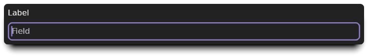
#![allow(unused)]
fn main() {
    impl MakeWidget for FormField {
        fn make_widget(self) -> WidgetInstance {
            self.label
                .align_left()
                .and(self.field)
                .into_rows()
                .make_widget()
        }
    }

    FormField::new(
        "Label",
        Dynamic::<String>::default()
            .into_input()
            .placeholder("Field"),
    )
}
The example FormField when rendered looks like this:
Approach B: Using the WrapperWidget trait
The WrapperWidget trait is an alternate trait from Widget
that makes it less error-prone to implement a widget that wraps a single other
child widget. The only required function is
WrapperWidget::child_mut, which returns a &mut WidgetRef.
Previously, we were using WidgetInstance to store our field.
When a WidgetInstance is mounted inside of another widget in a window, a
MountedWidget is returned. A WidgetRef is a
type that manages mounting and unmounting a widget automatically through its API
usage. It also keeps track of each window's MountedWidget.
Updating the type to use WidgetRef is fairly straightforward, and does not
impact the type's public API:
#![allow(unused)]
fn main() {
    use cushy::widget::{MakeWidget, WidgetRef};

    #[derive(Debug)]
    struct FormField {
        label: Value<String>,
        field: WidgetRef,
    }

    impl FormField {
        pub fn new(label: impl IntoValue<String>, field: impl MakeWidget) -> Self {
            Self {
                label: label.into_value(),
                field: WidgetRef::new(field),
            }
        }
    }
}
Instead of calling field.make_widget(), we now use WidgetRef::new(field).
Now, let's look at the WrapperWidget implementation:
#![allow(unused)]
fn main() {
    impl WrapperWidget for FormField {
        fn child_mut(&mut self) -> &mut WidgetRef {
            &mut self.field
        }

}
As mentioned before, this child_mut is the only required function. All other
functions provide default behaviors that ensure that the child is mounted,
positioned, and rendered for us. Running this example without the rest of the
implementation would show only the field without our label.
Before we can start drawing and positioning the field based on the label's size,
let's define a couple of helper functions that we can use to implement the
WrapperWidget functions needed:
#![allow(unused)]
fn main() {
    impl FormField {
        fn measured_label(
            &self,
            context: &mut GraphicsContext<'_, '_, '_, '_>,
        ) -> MeasuredText<Px> {
            self.label.invalidate_when_changed(context);
            self.label.map(|label| context.gfx.measure_text(label))
        }

        fn label_and_padding_size(
            &self,
            context: &mut GraphicsContext<'_, '_, '_, '_>,
        ) -> Size<UPx> {
            let label_size = self.measured_label(context).size.into_unsigned();
            let padding = context.get(&IntrinsicPadding).into_upx(context.gfx.scale());
            Size::new(label_size.width, label_size.height + padding)
        }
    }
}
The first function uses our graphics context to return Kludgine's
MeasuredText<Px> type. The second function looks up the
current size to use for padding, and adds it to the height of the measured text.
Advanced Tip:
MeasuredTextnot only contains the dimensions of the text we asked it to measure, it also has all the information necessary to draw all the glyphs necessary in the future. It would be more efficient to cache this data structure in aWindowLocaland only re-cache the text layout when needed.
The Widget::layout() implementation for WrapperWidgets splits the
layout process into multiple steps. The goal is to allow wrapper widget authors
to be able to customize as little or as much of the process as needed. The first
function we are going to use is
adjust_child_constraints():
#![allow(unused)]
fn main() {
        fn adjust_child_constraints(
            &mut self,
            available_space: Size<ConstraintLimit>,
            context: &mut LayoutContext<'_, '_, '_, '_>,
        ) -> Size<ConstraintLimit> {
            let label_and_padding = self.label_and_padding_size(context);
            Size::new(
                available_space.width,
                available_space.height - label_and_padding.height,
            )
        }

}
adjust_child_constraints() is responsible for adjusting the incoming
available_space constraints by whatever space we need to surround the child.
In our case, we need to subtract the label and padding height from the available
height. By reducing the available space, we ensure that even if a field is
wrapped in an Expand widget, we will have already allocated space
for the label to be visible with an appropriate amount of padding.
The next step in the layout process is to position the child:
#![allow(unused)]
fn main() {
        fn position_child(
            &mut self,
            child_size: Size<Px>,
            available_space: Size<ConstraintLimit>,
            context: &mut LayoutContext<'_, '_, '_, '_>,
        ) -> WrappedLayout {
            let label_and_padding = self.label_and_padding_size(context).into_signed();
            let full_size = Size::new(
                available_space
                    .width
                    .min()
                    .into_signed()
                    .max(child_size.width)
                    .max(label_and_padding.width),
                child_size.height + label_and_padding.height,
            );
            WrappedLayout {
                child: Rect::new(
                    Point::new(Px::ZERO, label_and_padding.height),
                    Size::new(full_size.width, child_size.height),
                ),
                size: full_size.into_unsigned(),
            }
        }

}
The above implementation calculates the full size's width by taking the maximum of the minimum available width, the child's width, and the label's width. It calcaultes the full size's height by adding the child's height and the label and padding height.
The result of this function is a structure that contains the child's rectangle
and the total size this widget is requesting. The child's rectangle is placed
below the label and padding, and its width is set to full_size.width. This is
to mimic the behavior our original choice of placing the widgets in a stack. In
our example, this is what stretches the text input field to be the full width of
the field.
The final step is to draw the label:
#![allow(unused)]
fn main() {
        fn redraw_foreground(&mut self, context: &mut GraphicsContext<'_, '_, '_, '_>) {
            let label = self.measured_label(context);
            context.gfx.draw_measured_text(&label, TextOrigin::TopLeft);
        }
    }
}
Because the Widget::redraw implementation takes care of drawing the
field for us, all this function needed to do was draw the label.
This is the result of using our new implementation:
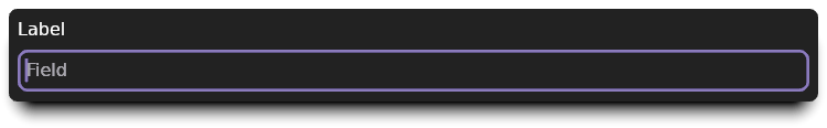
It looks the exact same as the previous image. That was our goal! Rest assured
that this image was generated using the WrapperWidget
implementation shown.
Approach C: Using the Widget trait
Implementing Widget is very similar to implementing
WrapperWidget, except that we are in full control of layout
and rendering. Since our WrapperWidget implementation needed to fully adjust
the layout, our layout() function is basically just the combination of the two
layout functions from before:
#![allow(unused)]
fn main() {
    impl Widget for FormField {
        fn layout(
            &mut self,
            available_space: Size<ConstraintLimit>,
            context: &mut LayoutContext<'_, '_, '_, '_>,
        ) -> Size<UPx> {
            let label_and_padding = self.label_and_padding_size(context);
            let field_available_space = Size::new(
                available_space.width,
                available_space.height - label_and_padding.height,
            );
            let field = self.field.mounted(context);
            let field_size = context.for_other(&field).layout(field_available_space);

            let full_size = Size::new(
                available_space
                    .width
                    .min()
                    .max(field_size.width)
                    .max(label_and_padding.width),
                field_size.height + label_and_padding.height,
            );

            context.set_child_layout(
                &field,
                Rect::new(
                    Point::new(UPx::ZERO, label_and_padding.height),
                    Size::new(full_size.width, field_size.height),
                )
                .into_signed(),
            );

            full_size
        }

}
The major difference in this function is that we are manually calling layout()
on our field widget. This is done by creating a context for our field
(context.for_other()), and calling the layout function on that context. After
we receive the field's size, we must call
set_child_layout() to finish laying out the field.
Finally, the result of the layout() function is the full size that the field
needs. With layout done, rendering is the next step:
#![allow(unused)]
fn main() {
        fn redraw(&mut self, context: &mut GraphicsContext<'_, '_, '_, '_>) {
            let label = self.measured_label(context);
            context.gfx.draw_measured_text(&label, TextOrigin::TopLeft);

            let field = self.field.mounted(context);
            context.for_other(&field).redraw();
        }

}
This function isn't much more complicated than the WrapperWidget's
implementation. The extra two lines again use context.for_other() to create a
context for the field widget, but this time we call the field's redraw()
function instead.
Finally, we have one last bit of housekeeping that WrapperWidget did
automatically: unmounting the field when the form field itself is unmounted.
This is important to minimize memory usage by ensuring that if the widget is
shared between multiple windows, each window's state is cleaned up indepdent of
the widget itself:
#![allow(unused)]
fn main() {
        fn unmounted(&mut self, context: &mut cushy::context::EventContext<'_>) {
            self.field.unmount_in(context);
        }
    }
}
And with this, we can look at an identical picture that shows this implementation works the same as the previous implementations:

Conclusion
Cushy tries to provide the tools needed to avoid implementing your own widgets
by utilizing composition. It also has many tools for creating reusable,
composible widgets. If you find yourself uncertain of what path to use when
creating a reusable component, try using a MakeWidget
implementation initially.
If using MakeWidget is cumbersome or doesn't expose as much functionality as
needed, you may still find that you can utilize MakeWidget along with a
simpler custom widget than implementing a more complex, multi-part widget. This
approach is how the built-in Checkbox, Radio and
Select widgets are all built using a Button.
Widgets
Types that implement Widget are the building
blocks of Cushy user interfaces. The built-in widgets each
aim to serve a single purpose or solve a single problem. Through
composition, complex user interfaces can be built by
combining these single-purpose widgets.
This section is organized into four categories of widgets:
- Multi-widget Layout Widgets: Widgets that are designed to layout multiple widgets as a single widget.
- Single-widget Layout Widgets: Widgets that are designed to influence a single widget's layout.
- Controls: Widgets that are visible to the user to present and/or interact with data.
- Utility Widgets: Widgets that have no direct layout or visual presentation. This type of widget usually associates extra data that may impact how child widgets are presented.
Multi-Widget Layout
Widgets in this section have a primary purpose of performing some layout functionality on a collection of widgets. These currently are:
- Grid: A 2D grid where each cell is a widget.
- Layers: A Z-direction stack of widgets.
- Stack: A 1D grid of either rows or columns.
- Wrap: Widgets are laid out horizontally, wrapping into multiple rows if needed.
Grid
The Grid widget lays out a set of widgets in a two dimensional grid.
It is constructed with a primary orientation, which can be given a set of
GridDimension to affect how the opposite orientation's
elements are measured.
For example, to create a grid that resembles a traditional table, use
Grid::from_rows to create the grid, and
Grid::dimensions would be used to control each column's
measurement strategy.
Alternatively when creating a grid with Grid::from_columns,
Grid::dimensions is instead used to control each row's
measurement strategy.
Layers
The Layers widget lays its WidgetList widgets on top of
each other in the Z orientation.
When computing its size, it uses the largest width and height from all of its children.
List
The List widget lays a set of WidgetList as a list of
items with an optional indicator. It creates lists in a similar fashion to
HTML's <ol> and <ul> tags.
A ListStyle controls the indicator and whether a trailing
delimiter is shown next to the indicator.
Stack
The Stack widget lays a set of WidgetList as either a set
of columns or rows. It is a convenient way to construct a 1D
Grid. It can be constructed using either:
The stack widget places spacing between each element called a gutter.
Wrap
The Wrap widget lays its WidgetList widgets out in a
fashion that mimics text layout.
It works by measuring each child with SizeToFit and laying out
the widgets into a series of rows. A fixed amount of spacing between
each widget can be applied.
Once the widgets have been grouped into rows, the alignment and
vertical alignment are applied to position the widgets on each row.
WrapAlign can be any of these strategies:
Start: Position the widgets at the start of the line, honoringLayoutOrder.End: Position the widgets at the end of the line, honoringLayoutOrder.Center: Position the widgets centered on each line.SpaceBetween: Position the elements evenly along the line with no space before the first widget or after the last widget.SpaceEvenly: Position the elements evenly along the line with an additional half of the spacing between elements before the first widget and after the last widget.SpaceAround: Position the elements evenly along the line with an additional equal amount of spacing before the first widget and after the last widget.
Single-widget Layout
Widgets in this section have a primary purpose of performing some layout functionality on a single child widget. To use one of these layout widgets with multiple widgets, first lay out the widgets using one of the multi-widget layout widgets.
The widgets in this category are:
- Align: Aligns its child relative to its parent's edges.
- Collapse: Shows/hides its child.
- Container: Visually contains a child. Useful for grouping related content visually.
- Expand: Resizes its child to occupy as much space as available.
- Resize: Restricts its child's size to be within a range of widths and/or heights.
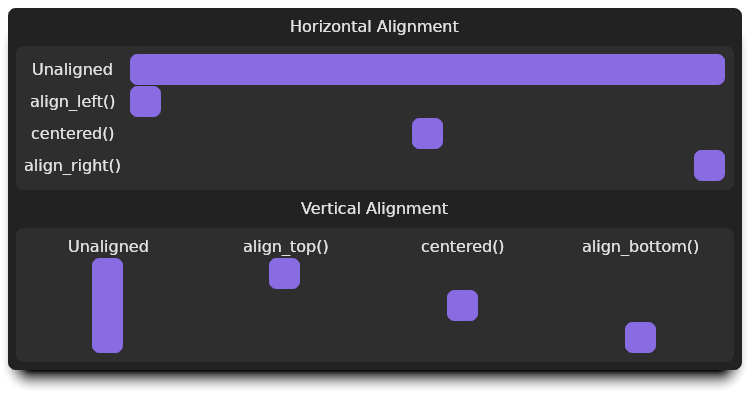
Aligning Widgets
The Align widget positions a child widget within its parent. It
supports both horizontal and vertical alignment.
It accomplishes this by requesting the child measure itself using
SizeToFit for the child's width and/or height, and then positions
the child to align it.
The align widget uses Edges<FlexibleDimension>
to specify the alignment of each edge. If an edge is
FlexibleDimension::Dimension, that edge of the child will be
placed the exact measurement from the parent's matching edge. If an edge is
FlexibleDimension::Auto, that edge will not be positioned relative
to the parent's matching edge.
Examples
The content() function in each of these snippets is a Space widget
occupying at least 32px squared:
#![allow(unused)]
fn main() {
fn content() -> impl MakeWidget {
    Space::primary().size(Size::squared(Px::new(32)..))
}
}
Align a widget to the left
Any widget can be aligned to the left using
MakeWidget::align_left():
#![allow(unused)]
fn main() {
    content().align_left()
}
Align a widget to the center
Any widget can be centered using
MakeWidget::centered():
#![allow(unused)]
fn main() {
    content().centered()
}
centered() works in both axis. To center only in one direction, "fit" the
other direction:
- To center vertically but occupy the parent's width, use
MakeWidget::fit_horizontally(). - To center horizontally but occupy the parent's height, use
MakeWidget::fit_vertically().
Align a widget to the right
Any widget can be aligned to the right using
MakeWidget::align_right():
#![allow(unused)]
fn main() {
    content().align_right()
}
Align a widget to the top
Any widget can be aligned to the top using
MakeWidget::align_top():
#![allow(unused)]
fn main() {
    content().align_top()
}
Align a widget to the bottom
Any widget can be aligned to the bottom using
MakeWidget::align_bottom():
#![allow(unused)]
fn main() {
    content().align_bottom()
}
Collapse
The Collapse widget shows and hides its child based on the value
of a Dynamic<bool>. It can collapse its child in either
orientation:
Collapse::vertical()/MakeWidget::collapse_vertically()Collapse::horizontal()/MakeWidget::collapse_horizontally()
Container
The Container widget encloses a widget in a visual container.
The Container's background color can be either specified explicitly, set using
a ContainerLevel, or automatically selected based on the
current container level. Each container level has an associated theme color.
When using automatic container levels and the highest-level container level is reached, the level will wrap to the lowest level.
Expand
The Expand widget expands its child to fill as much space as
available.
The Expand widget can be constructed to expand horizontally and/or vertically:
- Expand the child's width and height:
Expand::new/MakeWidget::expand - Expand the child's width only:
Expand::horizontal/MakeWidget::expand_horizontally - Expand the child's height only:
Expand::vertical/MakeWidget::expand_vertically
Resize
The Resize widget constrains and/or overrides its child's size.
The resize widget uses DimensionRanges to specify the
allowed range of dimensions that its child can use. DimensionRange implements
From for all of the built-in range types in Rust with Lp, Px, or Dimension bounds.
Controls
This section contains interactive widgets that read and/or write data through the reactive data model.
Button
The Button widget is an interactive widget that offers an on_click
callback when it is pressed. It has multiple visual styles, allowing it to be
used as a basis of many button-like widgets. The built-in widgets that utilize a
Button to create a specialized button type are:
Checkbox
The Checkbox widget is a Button that toggles a
CheckboxState when clicked.
CheckboxState contains three variants:
- Indeterminant: A horizontal line will be drawn in the box to show a state of neither checked or unchecked.
- Checked: A checkbark will be drawn in the box.
- Unchecked: No indicator will be drawn in the box.
Radio
The Radio widget is a Button that shows a circular
indicator when a Dynamic<T> contains the radio's associated value.
When clicked, the Dynamic<T> is updated to the radio's associated value.
Select
The Select widget is a Button that becomes
highlighted when a Dynamic<T> contains the select's associated
value. When clicked, the Dynamic<T> is updated to the select's associated
value.
Canvas
The Canvas widget invokes a function each time it needs to paint.
This function has access to a graphics context exposing most of
Kludine's 2D graphics API.
A Tick can be attached to the Canvas to have a callback invoked at a
steady rate. This tick function can be used to update the state of the Canvas,
and it can signal when the Canvas should be redrawn.
Color Pickers
A variety of building blocks are available to offer interfaces selecting colors in both RGB and HSL color spaces.
RgbPicker: Shows 3ComponentPickers for red, green, and blue.RgbaPicker: Shows 4ComponentPickers for red, green, blue, and alpha.HslPicker: Shows 3ComponentPickers for hue, saturation, and lightness.HslaPicker: Shows 4ComponentPickers for hue, saturation, lightness, and alpha.ComponentPicker<T>: Shows a gradient in a bar and allows selecting a singleColorComponent.
Delimiter
The Delimiter widget is used to draw a horizontal or vertical
delimiter. This widget is similar to HTML's <hr> tag.
Disclose
The Disclose widget hides and shows another widget with a
triangular disclosure indicator and an optional label.
Image
The Image widget displays an image/texture with configurable scaling
options.
Input
The Input widget is a basic text entry widget. It supports
generic-driven storage for some intuitive behaviors:
- When using a
String, a default text entry widget is used. - When using a
MaskedString, the text entry will be masked and the contained value will be zeroed before the storage is freed.
When an Input is masked, the system input manager is notified that it is a
password entry field.
Label
The Label widget is a read-only text widget. It is intended for
displaying information to the user in a non-interactive manner.
Menu
The Menu widget is a widget designed to work in an overlay layer. It
presents a pop-up menu and invokes a callback with the selected item if the user
selects an item.
ProgressBar
The ProgressBar widget draws an indicator to represent
progress. A progress bar can be indeterminant, empty, partially complete, or
fully complete.
The Progressable trait allows many types to be used within progress bars by
implementing one of several helper traits:
ProgressValue: This trait can be implemented for full control over how progress is reported.- Types that ipmlement
RangedandPercentBetweenhaveProgressValueimplemented automatically. This includes all numeric types in Rust..
Scroll
The Scroll widget presents the widge tit contains in a virtual
surface that can be scrolled horizontally and/or vertically.
Slider
The Slider widget allows selecting one or two values between a
minimum and a maximum. This is implemented using the trait
SliderValue, which is automatically implemented for types that
implement Ranged and PercentBetween. This
includes all numeric types in Rust.
The Slider widget can set either a single value or a tuple of 2 elements. When
a two element tuple is used, the slider highlights the area between the two
selected values.
Space Widget
The Space widget is used to fill space. It is not interactive, and
will always occupy the smallest size it can.
It can render a color or be clear.
Switcher
The Switcher widget allows switching between different widgets at
runtime. It can be used with a read-only WidgetInstance dynamic or a
convenience function that allows switching based on a mapping function that
produces the new widget to display.
TileMap
The TileMap widget provides a layered 2d surface that draws layers
of tiles or objects in a scrollable and zoomable 2d plane.
Validated
The Validated widget displays validation information around
another widget. This widget can be used to visualize input errors in forms.
Utility Widgets
The widgets in this section are non-interactive widgets that do not directly impact the layout of other widgets.
Custom
The Custom widget enables creating a new widget by providing
callbacks instead of creating a new type.
Data
The Data widget is a widget that can contain an arbitrary value. The
widget does not display or occupy any space. This is useful for ensuring a
resource isn't dropped while a user interface is displayed.
Style
The Style widget attaches style information for its contents.
Themed
The Themed widget overrides the theme for its contents.
ThemedMode
The ThemedMode widget allows changing the
ThemeMode of the widgets belonging to it.